By the way, if you're around t.o on Friday, go check out the Lora Zombie art show @ the Gladstone. She's an urban artist out of Russia and she rocks my world. Also, go check it out because Eyes on Walls is holding it, and Tom Rowlandson and his company are pretty cool.
RSVP to the fb event here.
Sunday, October 16, 2011
HERMIT
Hi. It has just been pointed out to me that I have been failing to use my blog. Work + school has taken over. While I get this stuff back in order, you can peep stuff on my online portfolio at http://craigmariah.grandportfolio.com/. easy
Sunday, April 10, 2011
Architects plan a "pedestrain palace" - Paris 2100
A new exhibit, which is the work of Yannick Gourvil and Cécile Leroux of the architecture firm Collectif et alors, is now displaying pictures of what Paris is hoping to look like for the year 2100 due to climate change. This new and improved city will be "a pedestrian paradise," where pedestrians rule and there are no cars, a roof garden on very building, and redesigned river banks and biking systems, just to name a few improvements. Paris is calling this new city a utopian, as it would be nothing short of paradise if these plans were to actually follow through. It is wishful thinking, but nothing is impossible! Check out a full article on this exhibit at the Treehugger website here. Here are a couple photos they had displayed to give you an idea of what they have in mind:


Friday, April 8, 2011
Packaging fun with new Smirnoff Caipiroska collection
Okay, so I'm sure most of you designers have already seen this new brilliant packaging for Smirnoff, but I can't help but write a little something about it. I'm a huge sucker when it comes to packaging, and this is such a fun and interactive idea. Good enough that it makes me wish I could drink! To launch the new Brazilian vodka, Smirnoff Caipiroska, a promotional package was made by JWT Brazi. Bottles were created with the appearance and texture through a perforation for the flavors lemon, passion fruit and berries. This was done on a skin that was also made "peelable" so that it could give the consumer the feel as if they were peeling an actual fruit. Unfortunately, since this was created specially for a promotional kit, there is a limited supply of these bottles. If you get your hands on one - enjoy!
Take a look at some featured photos of this new design:


Take a look at some featured photos of this new design:


I'm Back (Featuring Daniel Mackie)
So - after a long overdue visit, I think it's time for me to write a new post! Things have been hectic in my life for the past while to say the least, but I missed this thing. With that said, I've got a short blog for everyone tonight (maybe two or three if I stay awake), about a few latest inspirations.
Recently, I have been trying to push my boundaries with painting, and began playing with watercolour (which I hadn't done in 4 years, and was never good at to begin with!). While attempting to work with this new and tricky media, I had browsed through some artists who work with it as well to gain some inspiration. The artist I most recently came across is Daniel Mackie, who at one point created works mainly on the computer, such as myself, working with photoshop. After ten years he put the computer design to the side to focus more on what he really loved to do, which was working traditionally with pencil and watercolour. I stumbled upon a few of his works online just the other day and liked what I saw, so I took the time to look him up which took me to his website and online portfolio which you can view for yourself here. Daniel has worked with a countless number of clients, and his works of art have provided solutions for design material such as editorial and advertising works.
I also recommend you take a look at his blog, where you can get a great insight and see some truly remarkable illustrations and process work.
Here are a few of my favourite works of his displayed below.
 |
| Process work for ongoing project |
 |
| "Don Draper Portrait" |
 |
| "Fear" |
| "Fairy" |
Wednesday, January 26, 2011
Busy, Busy
Hey everyone. I've been so swamped with life on top of school that I haven't had any spare time to breathe, let alone blog! I'll be getting new posts up very soon (hopefully later today).
In the meantime, check out some of my work at http://www.behance.net/murrcraig. Cheers!
In the meantime, check out some of my work at http://www.behance.net/murrcraig. Cheers!
Monday, January 17, 2011
FUNiture on the Behance Network
Such great furniture by designer Luis Luna. Here is a preview below - go to FUNiture on the Behance Network to view the rest of this collection!


Wednesday, January 12, 2011
Velo Coffee Roasters: Chattanooga's only bicycle-powered coffee roaster
'Velo' is french for 'bicycle,' which is this company's main method for delivering their small-batch, specialty roasts. Velo Coffee Roasters has a great love for the city of Chattanooga (where the company is owned and ran), and strongly believes in treating their neighbours with special care - which is why they get their coffee specially delivered to the comfort of their own home. This company hits the streets daily on bikes to deliver to their city as well as supports the local farmer's market by selling their products there. They also try to encourage the consumers to visit their location personally to enjoy a fresh cup of coffee and get the opportunity to see how everything works. Not only is the idea and meaning behind this company great - but so is their packaging! Each order comes in one of these great bags which are protective, foil-lined, and heat-sealed to preserve freshness. Take a look! :)


Back to School (Artist Spotlight: Akiko Stehrenberger)
Stepped back into reality today - and it appears as though I actually missed it! I had my first day of my Graphic Illustration class, and my first assignment for the class will be to create a caricature of myself. Even though I am the worst illustrator, I'm really stoked on the class and completing this first project (especially because we can use any media we want which doesn't happen too often - hello paint!!). Our teacher (who is new to me but complimented my glasses so must be a cool dude) recommended some artists to research regarding the caricature assignment, which led me to viewing Akiko Stehtrnberger's illustrations - So rad.
Akiko graduated from the Art Center College of Design in 2000 and is working in L.A. as an art director and a designer for movie poster advertising while doing freelance work for magazines, portraiture, cd artwork and more. She has done such publications as SPIN, The Source, New York Press and more, and has received a great amount of recognition and press for her works. Akiko's editorial work includes some of my favourites by her, which I have displayed below. She has done illustrations of people such as Franz Ferdinand, Tupac, The White Stripes and more.
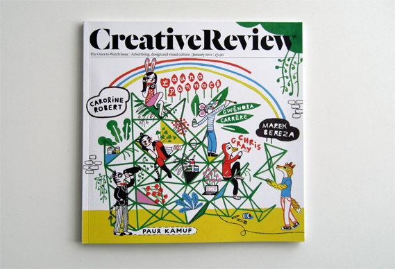
Check out Creative Review's 19 page zine of her illustrated movie poster work for their January 2011 Monograph series - It offers a glimpse into the 'what might have been' world of movie posters with a selection of her Hollywood poster proposals that never made it. The issue was released on December 16 2010 and features 'Ones to Watch' for 2011, which is based around six very talented people who are believed to make their mark in the art world this year. This includes illustrator Gwénola Carrère who created the cover of the issue, seen below. I highly recommend taking a look at the issue! Lots of great things to be seen!
Akiko graduated from the Art Center College of Design in 2000 and is working in L.A. as an art director and a designer for movie poster advertising while doing freelance work for magazines, portraiture, cd artwork and more. She has done such publications as SPIN, The Source, New York Press and more, and has received a great amount of recognition and press for her works. Akiko's editorial work includes some of my favourites by her, which I have displayed below. She has done illustrations of people such as Franz Ferdinand, Tupac, The White Stripes and more.
 |
| Kurt Cobain Acrylic. For article "Notes from the Underground" in Filter Magazine. Artwork also hand-painted on guitars signed by Kim Gordon as sweepstake prizes in promotion of the movie "Last Days" by Gus Van Sant. |
 |
| Macauley Culkin Acrylic. For "Deface the Face" competition, The Face Magazine. Displayed in Lions Den/Puma group show 2006. |
 |
| Yeah Yeah Yeahs For LeBook. |
Check out Creative Review's 19 page zine of her illustrated movie poster work for their January 2011 Monograph series - It offers a glimpse into the 'what might have been' world of movie posters with a selection of her Hollywood poster proposals that never made it. The issue was released on December 16 2010 and features 'Ones to Watch' for 2011, which is based around six very talented people who are believed to make their mark in the art world this year. This includes illustrator Gwénola Carrère who created the cover of the issue, seen below. I highly recommend taking a look at the issue! Lots of great things to be seen!

Monday, January 10, 2011
'This Is Dope' (Artist Spotlight: Kathryn Macnaughton)
Kathryn Macnaughton is an illustrator/graphic artist out of OCAD, living in Toronto, ON. Her work always draws my attention, using a great mix of illustration and collage with random patterns or shapes. She uses light pastel hues in her works which I find gives off a nice contrasting effect with her subjects (often porno suggestive) - which also often end up looking somewhat vintage, especially in her design/prints.
 |
| "This is Dope" |
 |
| "Love Music Hate Racism" |
 |
| "The List" |
HENNESSY V.S PRESENTS: Blending of Art
AN EXCLUSIVE COLLABORATION WITH 10 OF THE WORLD’S MOST MERCURIAL MUSIC AND GRAPHIC ARTISTS
I came across this series over the Christmas holidays, and loved it so much I have to post a blog about it.
Hennessy V.S Blending of Art celebrates the two as one, in a collaborative project that aligns the visually arresting with the sonically bold; the musically adventurous with the artistically free. An exclusive series of future thinking artworks that connect some of music’s most vibrant revolutionaries with visual artists and graphic designers that dance to the same beat.
“Music & Art have always gone hand in hand, pushing creativity and collaboration. What’s one without the other?”
Check out my favourite colab, featuring hip-hop artist, Q-Tip, and globally acclaimed graphic artist, Spaceknuckle aka Josh Vanover.

While you're at it, take the time to look at some of the other featured musicians and artists, such as Fafi Birtak, one of the most infamous female street and fine artists in the art and music scene. Here is an example of one of my favourite works by her as well:

Sunday, January 9, 2011
JR Art: Transforming neighbourhoods around the world
Artist, JR, along with Bill Clinton, accepted the TED prize of $100, 000 for "exceptional individuals" last year. I have been following this man's work, and can appreciate the good he is doing with his art. JR visits poor and struggling neighbourhoods around the world, and transforms them for the better with his massive prints of residents plastered on the exteriors of buildings. In some cases, like his project in Kenya - his work actually acted as support for the buildings, helping the community in more ways than one. Heads up for JR's film Women Are Heroes release on January 12.


New Olympic Games logo brings controversy
As the New Year was brought in, so was the new logo for the Olympic Games Rio 2016. The logo seems to be stirring up a lot of commotion, as Brazilian Tatil is being accused of plagiarizing the logo of the Telluride Foundation (seen below). In my opinion, for Brazilian Tatil to be accused of something like plagiarism for this logo design is just a bunch of nonsense. Sure, there are similarities. But couldn't we go ahead and say that BOTH of those logos in fact copied Matisse's "The Dance?" Hmmm? Also, let's be serious - compared to the London logo, who's really complaining?

Starbucks logo: timeline of future redesigns
In case you haven't already head, last week the Starbucks logo was re-designed for the first time in almost 20 years to celebrate their 40th anniversary. In the image below, Felipe Torre gives his take on the "inevitable evolution" of the logo. The new logo appears to be zoomed in, accentuating its mermaid figure, and had the border and text removed. The new design seems to be getting great feedback for the most part - I still have to sit on this one.

JORDAN BUCKLEY - Good Art, Good Music
Some good music rules, and when a band member is a wicked artist then they rule even harder.
After enjoying another Lazy Sunday getting in some laughs watching an oldy but a goody, Shit Happens, I figured why not continue on the lazy ETID fun and post a blog on Jordan Buckley.
First of all - if you haven't listened to their music, (wtf is wrong with you) do so now. I had been somehow unaware after being an ETID fan for a while that Jordan, the guitarist, was in fact doing the bands artwork until last year when I saw them play in Toronto and they announced that they were selling limited edition posters created by him. Since then, I occasionally check out his stuff, which is always pretty impressive. I'm completely envious of his control and capabilities with drawing (something I've always been lacking). Anyways - look at his art, listen to his music, or check out his super sweet shit on comfy ass clothes.
OH YA AND ADAM - GIVE ME MY SHINFO SHIRT
 |
| PEACED OUT |
DUFFY & PARTNERS Design
Duffy & Partners is by far one of my favourite design companies out there, and every time they come out with something new I fall in love. If you haven't heard of them before, they've worked with companies such as Minute Maid, American Eagle, Coca Cola, and Fresca (just to name a few). I always think about how amazing it would be to work in an environment like theirs (not to mention their office is GORGEOUS), and constantly find myself hopelessly browsing through their website.
Duffy & Partners can do it all, from branding to packaging to digital works. Not too long ago, they teamed up with Aveda, which is such a perfect match as they share a lot of the same views when it comes to the environment and design tools. The package design they created for Aveda Men is stunning. Since they came out with its new packaging, I have stopped every time walking by a shop with the products on display.
It is made from post-consumer material, and uses earth-tones perfectly giving off a completely fresh new vibe. Here's a couple shots of the new Aveda Men's line, as well as a couple other favourite design works of mine created by Duffy & Partners (which was almost impossible to narrow down).
 |
| Aveda Men |
 |
| Aveda Men |
 |
| Aveda Men |
 |
| Captains Deck, Target Field, Minneapolis |
 |
| Starbucks Doubleshot Cans |
 |
| Webb Restaurants |
CHOWNED! (Artist Spotlight: Krystian Wiebe)
My good frand, neighbs, and graphic design buddy, Krystian Wiebe, is a wicked artist and just recently started posting his stuff on his new Tumblr: Transcript the Notion. His style is dope and I sometimes wonder how a clean mind like his can think up some of the work he produces. My boyfriend is a fan of his work as well and is hoping to do a colab with him sometime in the near future for some print/graffiti work - which I hope they do. CHECK IT
 |
| “The window of opportunity” |
 |
| “the bridge to cloud 9” |
My roomie wants a new puppy...
which just makes me miss my old dog and want one even more! Thanks, Em!
I unfortunately lost my dog, Buddy, last fall before moving back to Barrie. I've always wanted one of these dogs... My friend Jer used to have one like it, and they're just like owning your own live teddy bear :) 2 cute

I unfortunately lost my dog, Buddy, last fall before moving back to Barrie. I've always wanted one of these dogs... My friend Jer used to have one like it, and they're just like owning your own live teddy bear :) 2 cute

Jen Mann
I came across Jen Mann's paintings awhile ago on IndiesArt and saved some of her work in a file on my laptop, which I fortunately just stumbled upon. Jen is an artist out of Mississauga, ON, and graduated from OCAD. I am in love with this girl's work. The way she portrays nature and its relationship with women in her paintings I find to be so soft and beautiful.
Jen's work is an attempt to undress society, to remove ideas of propriety, and to find beauty and peace in the natural and instinctive. Her art is an outlet for images that free her from the weight of the social structure that suffocates creativity.
Jen's work is an attempt to undress society, to remove ideas of propriety, and to find beauty and peace in the natural and instinctive. Her art is an outlet for images that free her from the weight of the social structure that suffocates creativity.
 |
| "Don't hide your face dear" 30" x 24" Oil on Canvas 2010 |
 |
| "Rushmore" 24" x 30"" Oil on Canvas 2009 The swan is such a magnificent animal - I am so in love with this |
SUP, BLOGGER?
Welcome to Obey the Muse! Get stoked on some blogging fun surrounding everything I love - which means lots of art design and rock and roll dance parties. ;)
This also means I'm going to be up all night blogging until I have a satisfying amount of posts on here to start me off. Party on.
This also means I'm going to be up all night blogging until I have a satisfying amount of posts on here to start me off. Party on.
Subscribe to:
Posts (Atom)